SellCRE

Year
2025
Role
Founding product designer, then design lead
Platform
Web app, OM editor & marketing site
SellCRE

SellCRE turns one property address into a finished marketing package for commercial real estate brokers.

Before a property can be sold, a broker builds a package around it: an offering memorandum with property details, financials, maps and comparables, plus brochures, flyers, ads and emails.

I designed SellCRE from the ground up: the flows, the structure, every screen and the templates. As the product grew, I grew the design team around it and led five designers.

Design process

Designing the product through research, structure and iteration.

01

Discover

  • Workflow audit: CoStar → Excel → Word
  • Broker pain points
02

Define

  • User flow
  • Information architecture
03

Design

  • Wireframes
  • UI design
  • Design system
04

Build

  • Front-end build
  • Dev handoff
05

Grow

  • Marketing website
  • Led a team of five designers

The problem

One listing, five tools and hours of retyping.

To market a single property, brokers copied the same numbers from reports into spreadsheets, documents and design files. Every hand-off was a chance for errors and delays, and every package looked different.

TaskBeforeWith SellCRE
Pull property detailsCopied from CoStar and reportsFetched from the address
Underwriting & financialsRebuilt in ExcelExtracted by AI, editable grid
Summaries & selling pointsWritten from scratch in WordOptional AI draft
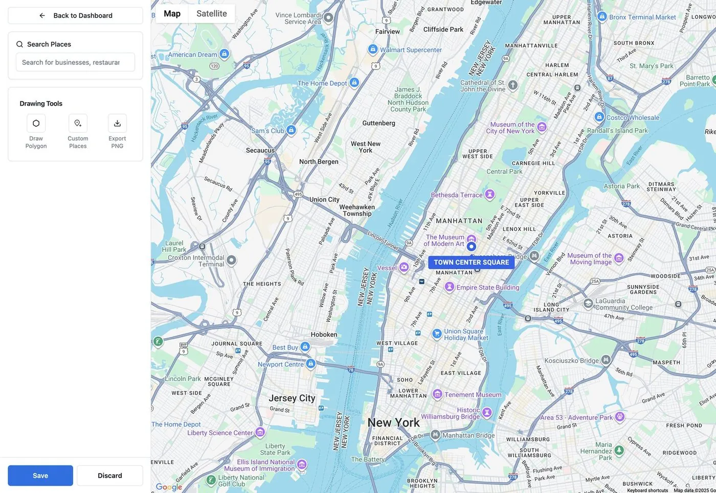
Maps & points of interestScreenshotted and annotatedBuilt-in map maker
OM layout & brochuresDesigned in separate appsTemplates + visual editor
Brand consistencyChecked by hand on every fileBrand kit applied automatically

How might we

help a broker go from one property address to client-ready marketing, with AI doing the heavy lifting and the broker staying in control?

Who we designed for

Two people behind every listing package.

Proto-personas built from what the team knew about our broker users. They kept every decision tied to a real job to be done.

LB

Primary user

The listing broker

Senior broker at a commercial brokerage

Wins mandates and needs listings on the market fast. Spends time with clients, not in spreadsheets.

Goals

  • List properties in hours, not days
  • Materials that win the client
  • Control over the wording

Frustrations

  • Retyping data from reports
  • Waiting on others for layouts
  • Generic AI copy
MC

Secondary user

The marketing coordinator

Supports several brokers on a team

Turns brokers’ notes and numbers into polished packages, and owns brand consistency.

Goals

  • On-brand output every time
  • Accurate financials
  • Fast edits on request

Frustrations

  • Copying between tools
  • Rebuilding layouts
  • Endless revision rounds

User flow

One mental model: upload, review, publish.

I mapped the whole journey before drawing a single screen. Every step falls into one of three stages, and the stage is always visible at the top of the app.

01 Start

  1. Sign up / log in
  2. Profile & brand kit
  3. Choose property type

02 Upload

  1. Enter property address
  2. Data fetched automatically
  3. Has reports?
    YesAI extracts from CoStar or PDFsNoSkip and continue
  4. Add property images

03 Review

  1. Check pre-filled details
  2. Use AI assist?
    YesAI drafts, broker editsNoWrite it manually
  3. Location & maps
  4. Underwriting & comparables

04 Publish

  1. Pick a template
  2. OM, brochure, flyer, ads and emails generated
  3. Refine in the visual editor
  4. Download, print or share

Information architecture

Breaking a long document into bite-sized steps.

An OM covers a lot of ground. I grouped every field into five review tabs, each with a short list of sub-steps, so brokers only ever see one small form at a time.

Property wizard
General
  • Basic info
  • Selling points
  • Highlights
  • Features
  • Summary
Location
  • Location summary
  • Maps
Underwriting
  • Unit mix
  • Income
  • Expenses
  • Loan
  • Analysis
Comparables
  • Sale comparables
Demographics
  • Area demographics
  • Tenant profile

Wireframes

Structure first, pixels second.

Low-fidelity layouts of the four key screens. They let us agree on hierarchy and navigation before any visual design.

123 Address St, City…
AAddress entry. One centred field with autocomplete. Nothing competes for attention.
AI assist
BReview wizard. Stage on top, tabs below, sub-steps on the left. AI assist sits beside the form, never in the way.
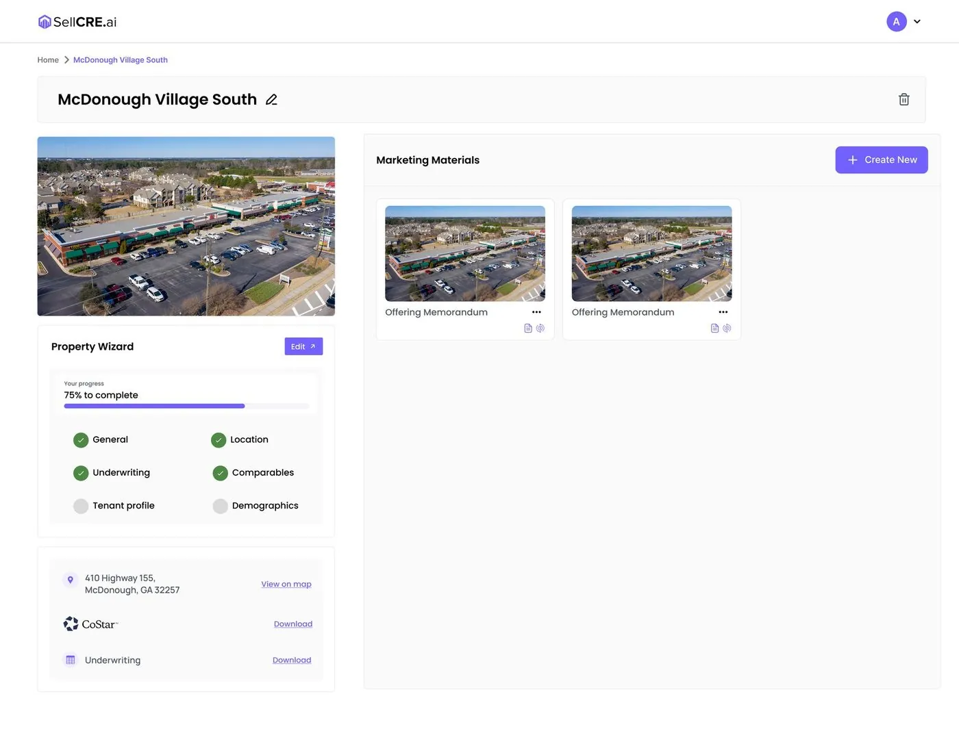
CProperty dashboard. Photo, wizard progress and every marketing material in one view.
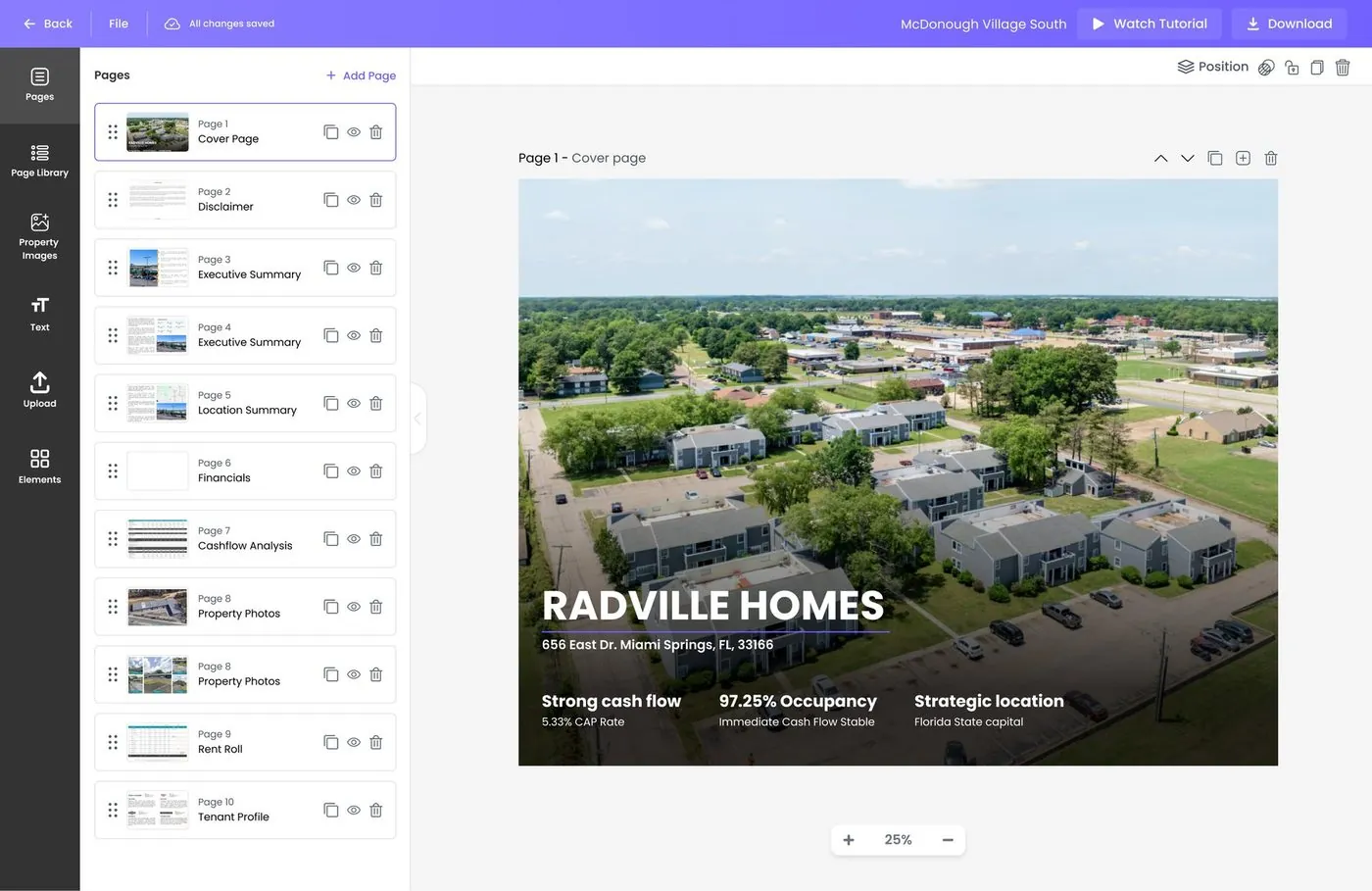
DOM editor. A familiar document-editor layout: tools, page list and a large canvas.

Visual system

A calm interface for serious money.

Brokers handle multi-million-dollar properties. The UI stays light and quiet so photos and numbers stand out, with one confident purple for actions and progress.

Primary#7A6AFFActions · progress
Tint#EEEBFFSelected · AI
Ink#1E1E2DText
Surface#F7F7FABackgrounds
Success#2EBD6BCompleted steps
Aa

Poppins · semibold, medium, regular

Property Summary

Selling points

Situated just 30 minutes from bustling Atlanta.

Components

Stage tracker: upload, edit, publish, always on top
AI is a choice, not a default
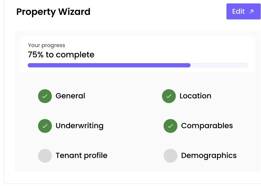
Wizard progress on the property’s home
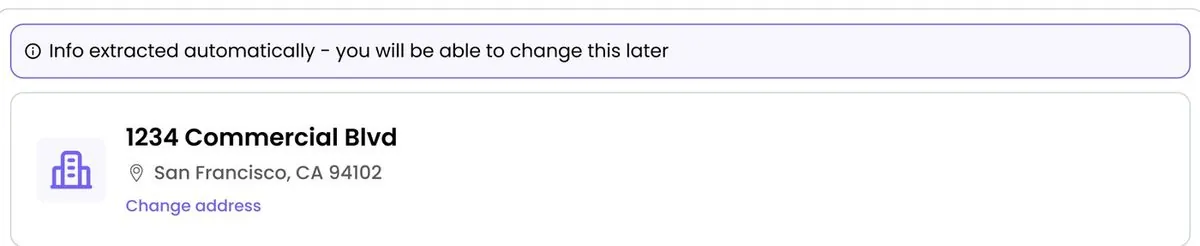
Address card: everything below was filled in from it
Choose how to proceed: reports or financials

From one address to a finished OM, step by step.

Following one listing through the live product, from first login to a client-ready offering memorandum.

01 Onboarding

Set up once, on-brand forever.

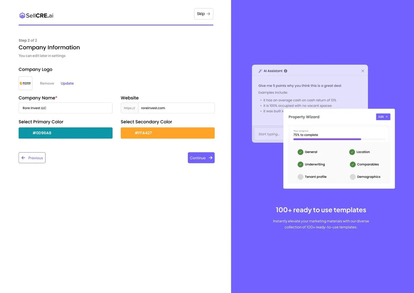
A short two-step onboarding captures the broker’s profile, company logo and brand colours. Every template then uses them automatically.

sellcre.com
Brand kit onboarding

02 Start a package

Pick a property type, type one address.

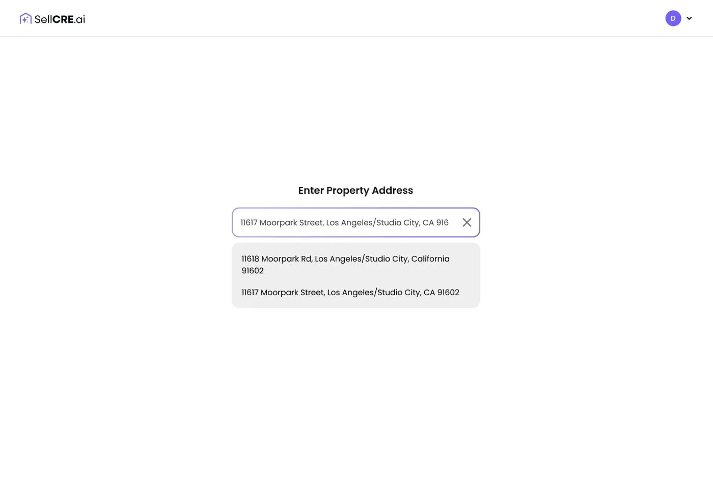
Templates and fields adapt to the asset type. Address autocomplete prevents typos, and the data starts loading straight away.

sellcre.com
Address entry

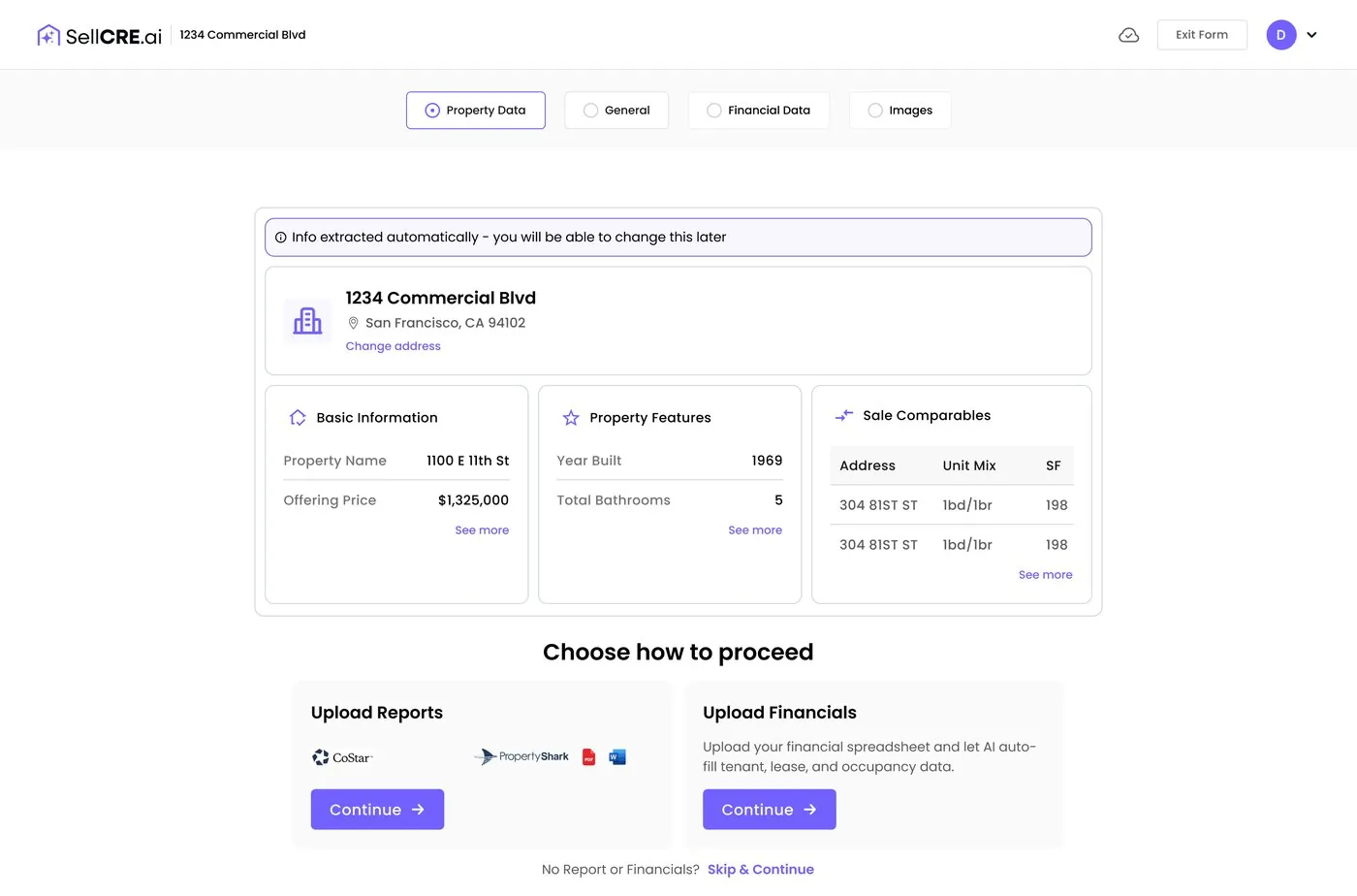
03 Auto-filled data

The rest fills itself in.

Property information, features and sale comparables are pulled in automatically. Brokers check and correct instead of typing.

sellcre.com
Property data pulled in from the address

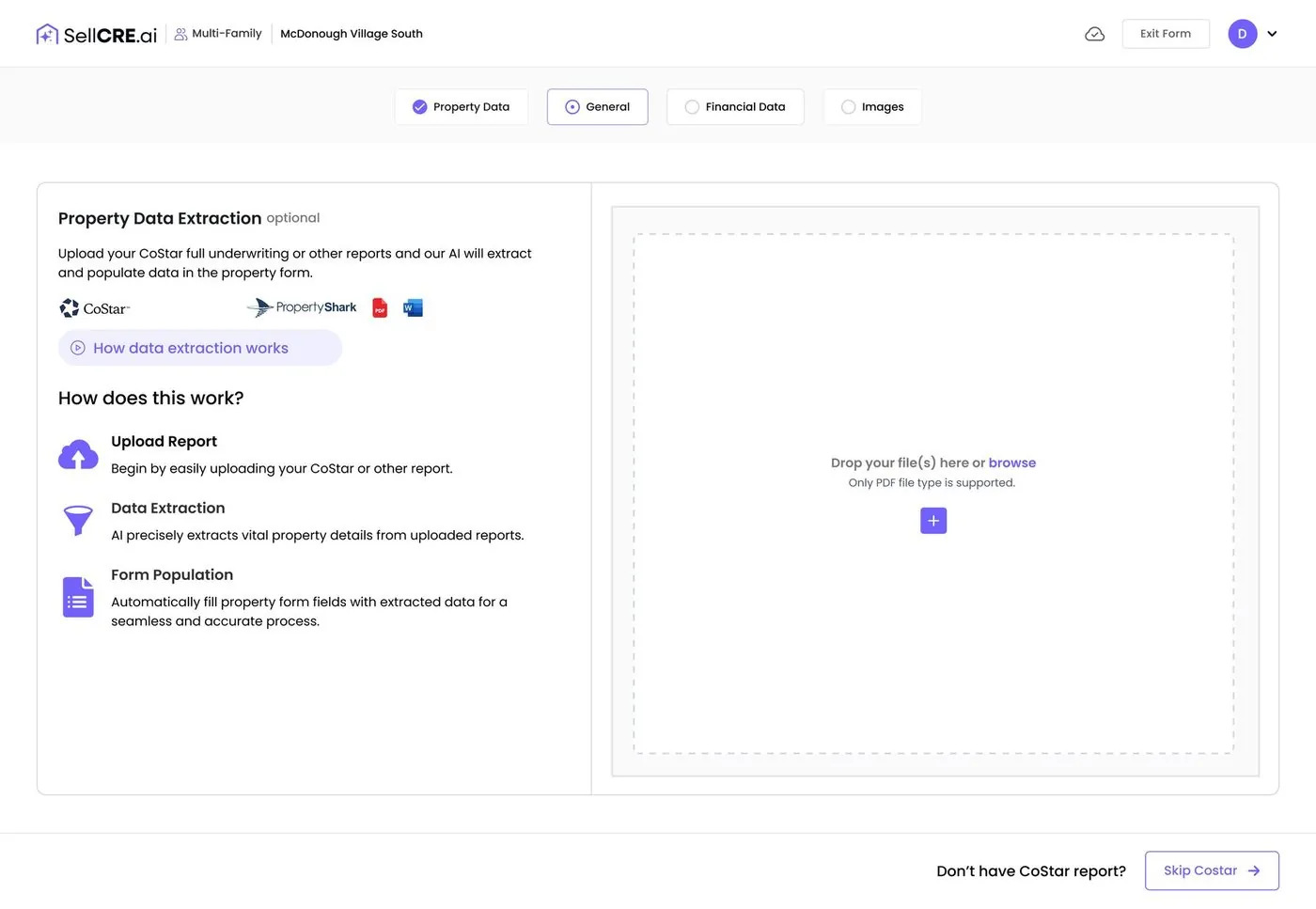
04 AI data extraction

Drop in a report, AI does the reading.

Upload a CoStar report, rent roll or cash-flow sheet. AI extracts the details and fills the forms, and every value stays editable.

sellcre.com
AI data extraction from documents

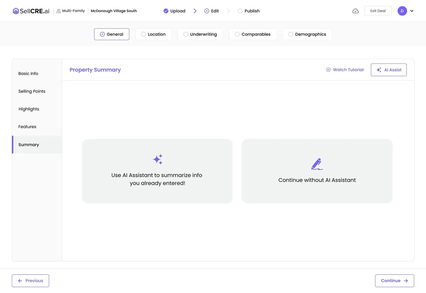
05 Review wizard

A guided wizard, never a giant form.

Brokers choose whether AI writes the summary or they write it themselves. Selling points are short, structured and always editable.

sellcre.com
Review wizard with optional AI

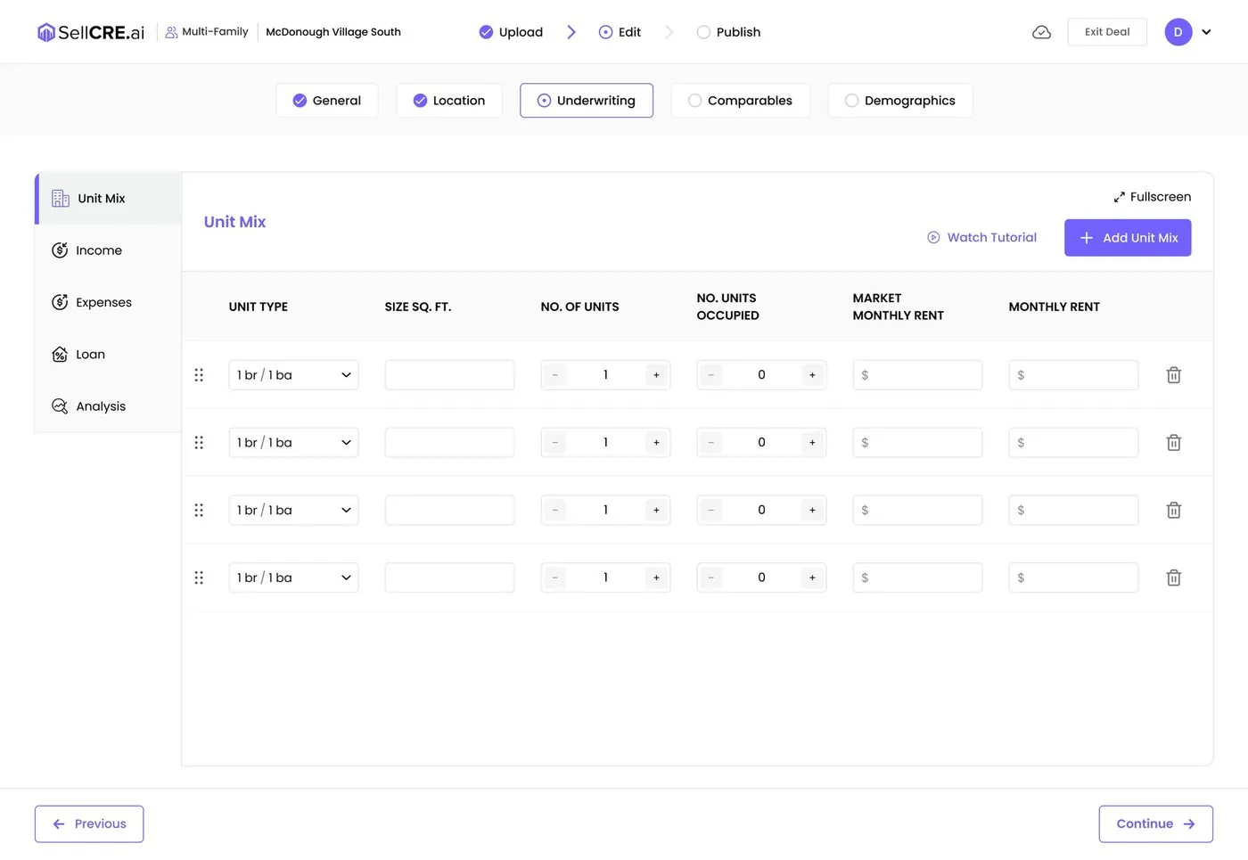
06 Underwriting

Numbers that feel like a spreadsheet.

Unit mix, income, expenses and five-year projections in a familiar grid, with totals calculated automatically.

sellcre.com
Underwriting unit mix grid
sellcre.com
SellCRE map maker

07 OM editor

Client-ready, refined in a visual editor.

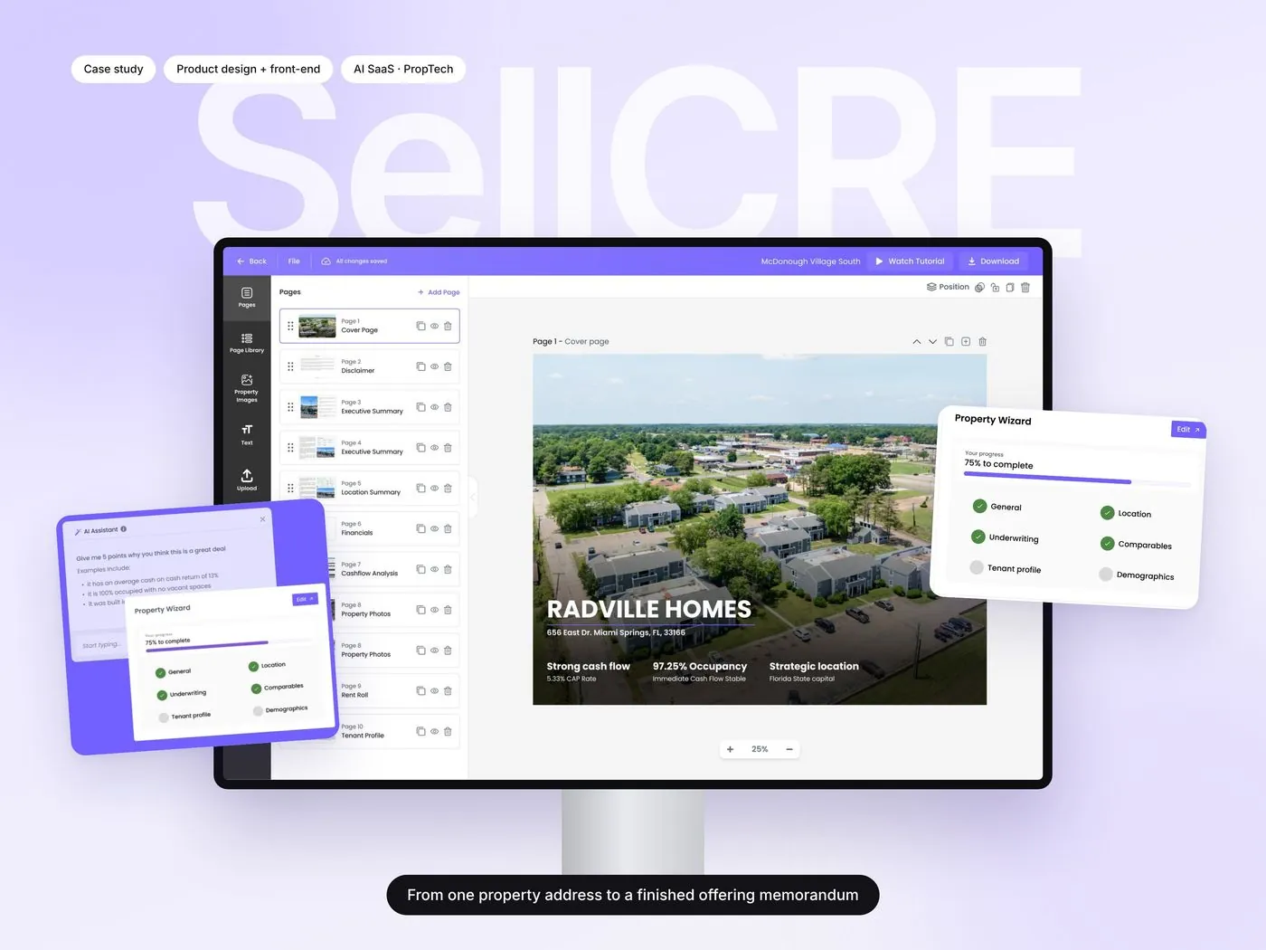
Every page of the offering memorandum in one list. Brokers reorder pages, swap templates and edit text and images right on the page.

sellcre.com
Offering memorandum editor

08 Property dashboard

Every listing has a home.

Photo, wizard progress and every generated material for a property in one view, ready to open, download or share.

sellcre.com
Property dashboard

09 Marketing website

I also designed the site that sells it.

A homepage and feature pages for AI property data, AI financial data, OM creation and custom maps, written and laid out for brokers.

sellcre.com
SellCRE marketing homepage

A live product, used by brokers at Colliers, Marcus & Millichap, RE/MAX and Weichert.

1address to start a full marketing package
20+templates across marketing materials
5→1tools replaced by one platform
3simple stages: upload, edit, publish

What I learned

01

Optional AI earns trust

Making AI a choice, and keeping every word editable, made brokers comfortable using it.

02

Structure beats features

The upload, review, publish model did more for usability than any single screen.

03

Designing and building together

Building the front end myself meant fewer gaps between the design and the shipped product.

Next project

TripperBus
TripperBus